The project is coming along nicely. We have a lot of work to to and only 4 weeks left. I am pleased we chose an ambitious project. We could have played it safe but I would prefer to push myself and go hard on a project I am passionate about then play it safe just to make the grade. Being on a creative couse we should already know that the degree, that piece of paper will not get us the job. Weather I leave here with a first or a last in Digital Animation is not the point, (obviously I want that first. I'm not a fool.) what we want is that showreel, portfolio and idea to take out into he world.
I remember what Richard "The Legend" Morrison said about fear in his seminar. Because thats what I am feeling now. Fear. You know when you are working on something but there is that part of you that thinks "Damn, this is a lot of work. Little time." But I dont let it stop me. Use the fear, let it fuel you. Thats what I got from Richard. I think he was very impressed with our project and I can't wait to send it to him and slip it into my showreel.
I remembered a conversation me and Kirk had with Georg about the FMX festival and the standard of work we are in competition with. Its a little bit scary. After watching work like 'Lume' from those german student. All you can do is sigh and drag yourself back to the animation studio. These are the people we are compete for jobs against. The people on my course I see myself as working with not against. The competition is fierce, the standards are high and we have a lot to learn. I'm going to work at this until it becomes a life style not a degree course. Because thats how bad I want it.
Right, now about this blog post...
Title Sequence Typography
When it comes to typography for animators I can imagine it is quite tricky. It has be able to stand on its own two feet on screen because what works in print does not always fork well when in motion and some fornt have been designed for print where others have been designed for the screen. As I come from a design background, and being Head of Design for the student newspaper I am confident with typography.
Sherlock Holmes Screenshots (below)
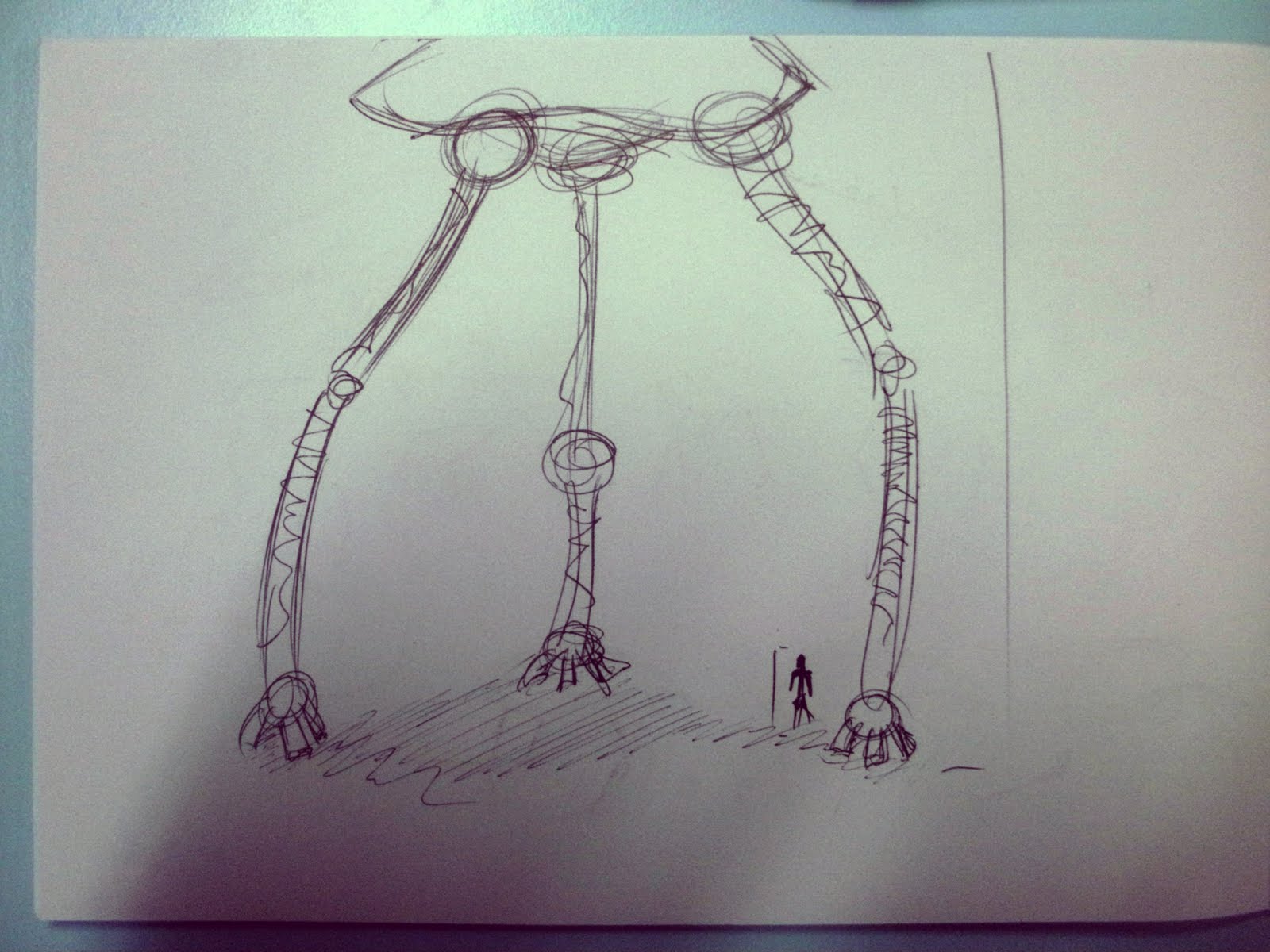
War of The Worlds: Tripod Character Design
not bad but its a start....
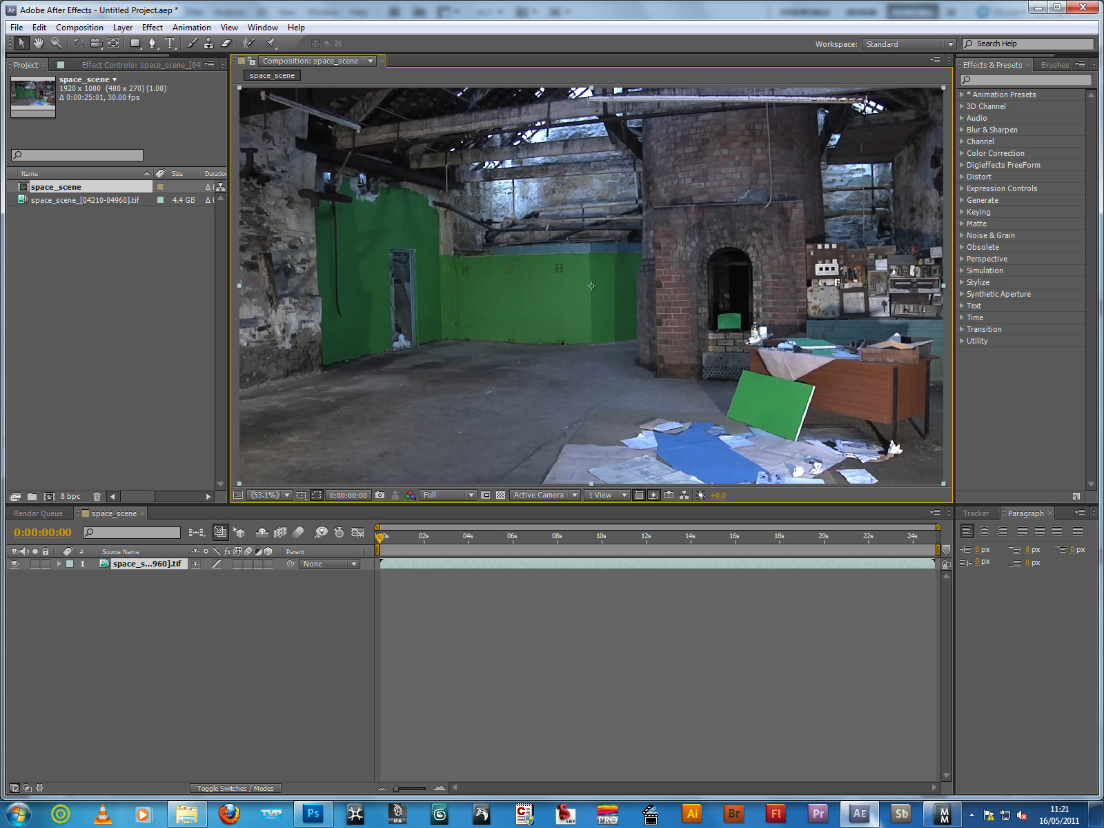
MachMover 2011: Test
 |
| Screenshot from the raw footage. |
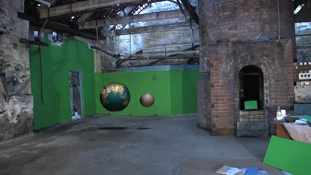 |
| Screenshot from the final piece with 3D elements. |
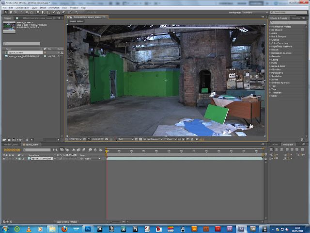 |
| Screenshot from After Effects. |
It took me a while to export the images in the correct file format from after effects to get them into MachMover 2011. I have been trying to do it since saturday and found the answer in the corner of the internet on an old online forum. Its interesting how computers will have a tantrum if you use the wrong file format.
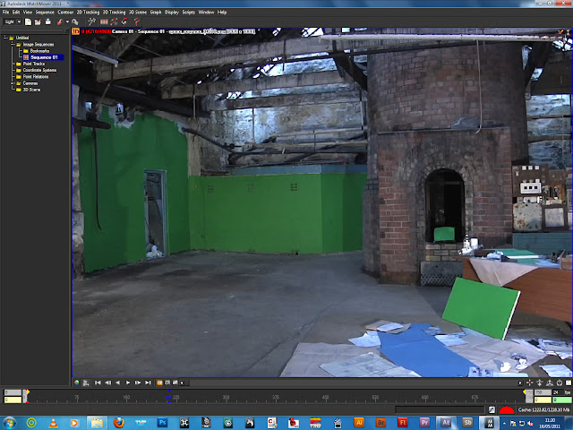 |
| Screenshot from MachMover 2011. |
This is now my favorite programme. I was lucky enough to find a tutorial for the programme in the latest issue of 3D Artist Magazine. It became my bible. After much trail and error I was able to get a very good track. I used a lot of tracks that I had placed myself as opposed to the automatic track. I only used a 7 second clip as it take a very long time. The key here was to just get my head around the software. I will definably get my hands on MachMover as it is a great piece of software. Just a shame it cost £10,000 (don't quote me on that).
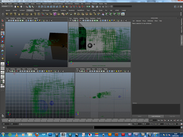 |
| Screenshot from Maya 2011. |
Luckily importing the the tracking data (those green crosses) into Maya 2011 was the easy bit. I did have some issues getting the image plane to appear (once again some file format issues) but once I had sorted it. I see how tricky it is for CG artists to really place 3D elements into a scene as it relies on so many different things. The models, textures, lighting, etc are not not perfect. I know. I have learnt something new. The only was I was able to really place it in the scene was ensuring I had applied it in a believable place in the scene was through the use of shadows. I have not bothered to use the enve ball shader to light the scene because I just want to get my head around the work flow.
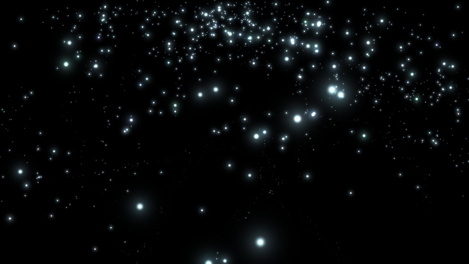
Tomorrow I will back in the studio tying to get a track on the whole 25 second shot, key out the green screen in after effects, model, texture, light, the Earth and the moon perfectly, and come up with a few more concepts for my Tripod character.